The Art of Design in Accessories and Clothing: A Style-Conscious Guide

The Art of Design in Accessories and Clothing: A Style-Conscious Guide

In a world where trends change by the swipe and wardrobes are updated every season, real style is no longer about owning more. It is about choosing better. The art of design sits at the center of that shift. When you understand how design really works in accessories and clothing, getting dressed becomes less about guessing and more about creating.

This guide will walk you through thinking like a designer when choosing and wearing accessories, making your outfits feel intentional rather than accidental, and building a signature style that quietly turns heads.

1. Why Design Matters More Than “Drip.”

Many stylish people own beautiful pieces, but still feel like their outfits are missing something. The problem is usually not the items themselves but the design decisions behind how those items are combined.

Design is the intentional arrangement of elements to create a desired effect. In fashion, those elements include color, shape, texture, proportion, line, and balance. When you wear accessories without understanding these elements, you rely on luck. When you apply design principles, you create outfits that feel cohesive, elevated, and personal.

Think about the difference between a random stack of bracelets and a curated wrist. The random stack might feature nice pieces, but the curated wrist has a clear story: a repeating metal tone, a balance of widths, maybe one focal piece and supporting pieces around it. That is design at work.

2. The Core Design Principles Behind Great Style

Before diving into specific accessories, it helps to understand the design principles that guide everything.

2.1 Balance

Balance is how visual weight is distributed in an outfit. Heavy boots, a chunky watch, and a bold chain on a slim frame can make a minimal outfit feel bottom-heavy or overwhelming. The goal is to counterweight bold elements.

If you are wearing a dramatic necklace, keep earrings smaller. If your bag is oversized and structured, pair it with clean, simple shoes. Balance keeps your look from feeling noisy or lopsided.

2.2 Proportion

Proportion is the relationship between different sizes and shapes in your look. It includes the ratios between your clothing and accessories, and between your outfit and your body.

Long, delicate necklaces elongate the torso. Short, chunky chokers bring attention upward and can visually shorten the neck. Oversized earrings work best when your neckline and shoulders are more open or simplified. Paying attention to proportion helps you choose accessories that flatter your unique frame rather than fight it.

2.3 Harmony and Contrast

Harmony is when pieces feel like they belong together. Contrast is what keeps things interesting. Great style usually has both.

Wearing all minimal, small-scale accessories can feel too quiet. Wearing all oversized, high shine, heavily detailed pieces can feel chaotic. A harmonious base with one or two contrasting pieces creates a focal point without overpowering.

For example, a minimal black dress (harmonious base) paired with one sculptural gold cuff (contrast and focal point) feels intentional and chic.

2.4 Rhythm and Repetition

Rhythm in design comes from repeating elements in a way that feels deliberate. In outfits, that might mean repeating a metal tone, a color, or a shape.

If you wear a silver necklace, a silver ring, and a bag with silver hardware, the repetition ties everything together. If your earrings have circles and your belt buckle and bag clasp echo that circular shape, the look feels subtly united.

3. Designing With Color: The Fastest Way To Elevate Accessories

Color is one of the easiest and most powerful design tools you can use with accessories.

3.1 Pick Your Metal Story

Most people look better in either warmer metals (gold, brass, bronze) or cooler metals (silver, platinum, white gold). This is not a rule you must never break, but choosing one main metal “story” as your base instantly makes your accessories feel more designed.

Once you have a dominant metal, you can occasionally mix, but do it with intention. For example, wear mostly gold, then introduce a mixed-metal piece that already blends silver and gold. That way, the mix looks purposeful.

3.2 Use Accessories To Control Color Intensity

If you love color but feel nervous about bold clothing, accessories are your training ground. A neutral outfit can handle a vivid bag, a jewel-toned scarf, or a colored statement earring.

You can also use accessories to echo the colors in your clothes without being too matchy-matchy. If you are wearing a printed dress with hints of blue, a pair of blue earrings, or a ring with a blue stone will pull that color out and make the whole look feel more curated.

3.3 Create Color Bridges

A color bridge is an accessory that connects two colors in your outfit so they do not clash. For example, if you are wearing a black top and tan pants, a belt or bag that includes both black and tan in its design acts as a bridge, making the combination look cohesive.

Prints, marbled materials, and multi-tone metals are great for creating color bridges.

4. Shape, Texture, and Movement: The Silent Style Shifters

Accessories are not just about color. Their shape, texture, and movement change the entire mood of your look.

4.1 Shape

Geometric pieces feel modern and structured. Organic, irregular shapes feel artistic and softer. If your clothing is very tailored and sharp, adding a few organic shapes can relax the look. If your clothing is loose and flowing, geometric pieces can add structure and polish.

4.2 Texture

Texture is where accessories can do what clothing alone cannot. Leather, metal, beads, stones, woven materials, satin, and matte finishes all carry different personalities.

A simple T shirt and jeans can look elevated with a structured leather bag, a smooth metal watch, and a beaded bracelet. The contrast in textures creates visual depth without resorting to loud colors or prints.

4.3 Movement

Pieces that move, such as fringe earrings, layered necklaces, or charm bracelets, add life to your outfit. A little movement feels playful and dynamic. Too much can become distracting.

Use movement near the area you want to draw attention to. Earrings with movement draw the eye to the face. A charm anklet draws the eye down to the shoes. Be conscious of where your accessories are leading the viewer’s eye.

5. Building A Signature Accessory Style

True style-conscious people do not just wear accessories. They develop a recognizable accessory language.

5.1 Choose Your Trademark Elements

Ask yourself:

  • Do I want to feel more minimal or more expressive?
  • Do I prefer smooth and sleek, or textured and detailed?
  • Which metal feels most like “me”?

Once you identify your preferences, choose 2 to 3 trademark elements. For example:

  • Always a stack of thin rings
  • Always a delicate necklace layered with one meaningful pendant
  • Always wear bold earrings on evenings out
  • Always a statement watch

When these elements repeat across your outfits, people start to recognize your style even when your clothes change.

5.2 Curate, Do Not Collect

Instead of chasing every trend, curate your accessories as if you are building an art collection.

Ask these questions before buying:

  • Does this piece work with at least 3 outfits I already own?
  • Does it fit my metal, color, and shape preferences?
  • Is it replacing or upgrading something I rarely wear?

This mindset keeps your accessory collection focused and powerful, rather than cluttered and confusing.

5.3 Layering With Intention

Layering is where many style-conscious people either shine or stumble. The key is a clear hierarchy.

  • One focal piece: the star of the look
  • Two or three supporting pieces: simpler, smaller, or more neutral

For necklaces, you might layer three:

  • A short, delicate chain near the collarbone
  • A mid-length pendant
  • A slightly longer, simpler chain

They should sit at clearly different lengths, not fighting for the same space.

With bracelets, mix widths and textures, but keep metal consistent. With rings, leave one or two fingers more bare so the eye has somewhere to rest.

6. Matching Accessories To Different Clothing Silhouettes

Design does not happen in a vacuum. The success of any accessory depends on what you pair it with.

6.1 With Minimal, Clean Outfits

When your clothing is simple, you have more room to play with accessories.

Think of a white shirt and tailored trousers. You can go in several directions:

  • Polished: small hoop earrings, a slim watch, and a structured bag
  • Creative: sculptural earrings, a bold cuff, and an artsy bag
  • Luxe minimal: fine layered necklaces, delicate rings, and a soft leather tote

The design question is: what mood do you want this simple base to convey?

6.2 With Printed or Detailed Outfits

When your clothes are already doing a lot, accessories should support, not compete.

Choose simpler shapes, fewer pieces, and colors that echo the print rather than introduce too many new tones. For instance, with a floral dress featuring gold print, small gold hoops, and a thin bracelet, you might be all you need.

6.3 With Oversized or Relaxed Fits

Oversized silhouettes can drown out tiny, delicate accessories. Here, you often need slightly bolder pieces to hold their own.

Chunkier chains, larger hoops, substantial watches, or structured bags balance the ease of oversized clothing and keep you from looking lost in fabric.

7. From Closet To Canvas: A Simple Daily Styling Process

To apply the art of design to your real life, try this 5 step process when you get dressed.

  1. Start with your base outfit.
  2. Decide the mood: polished, playful, edgy, romantic, minimalist, etc.
  3. Choose your metal story and 1 focal accessory.
  4. Add 2 to 3 supporting accessories that repeat a color, metal, or shape.
  5. Step back and check balance, proportion, and comfort.

Over time, this process becomes second nature. You will start to see your closet as a toolkit rather than a pile of random pieces.

8. Elevate Your Style With Thoughtfully Designed Accessories

When you treat accessories and clothing as parts of a designed whole, everything changes. Outfits feel more intentional. You rely less on trends and more on your own eye. People will not always know exactly what is different, but they will sense the refinement.

If you are ready to take this from theory to reality, explore our curated accessories designed with these design principles in mind. Each piece is made to mix, match, and layer beautifully so you can build your own signature style instead of starting from scratch every time.

Visit our collection today and start designing your look, one accessory at a time.
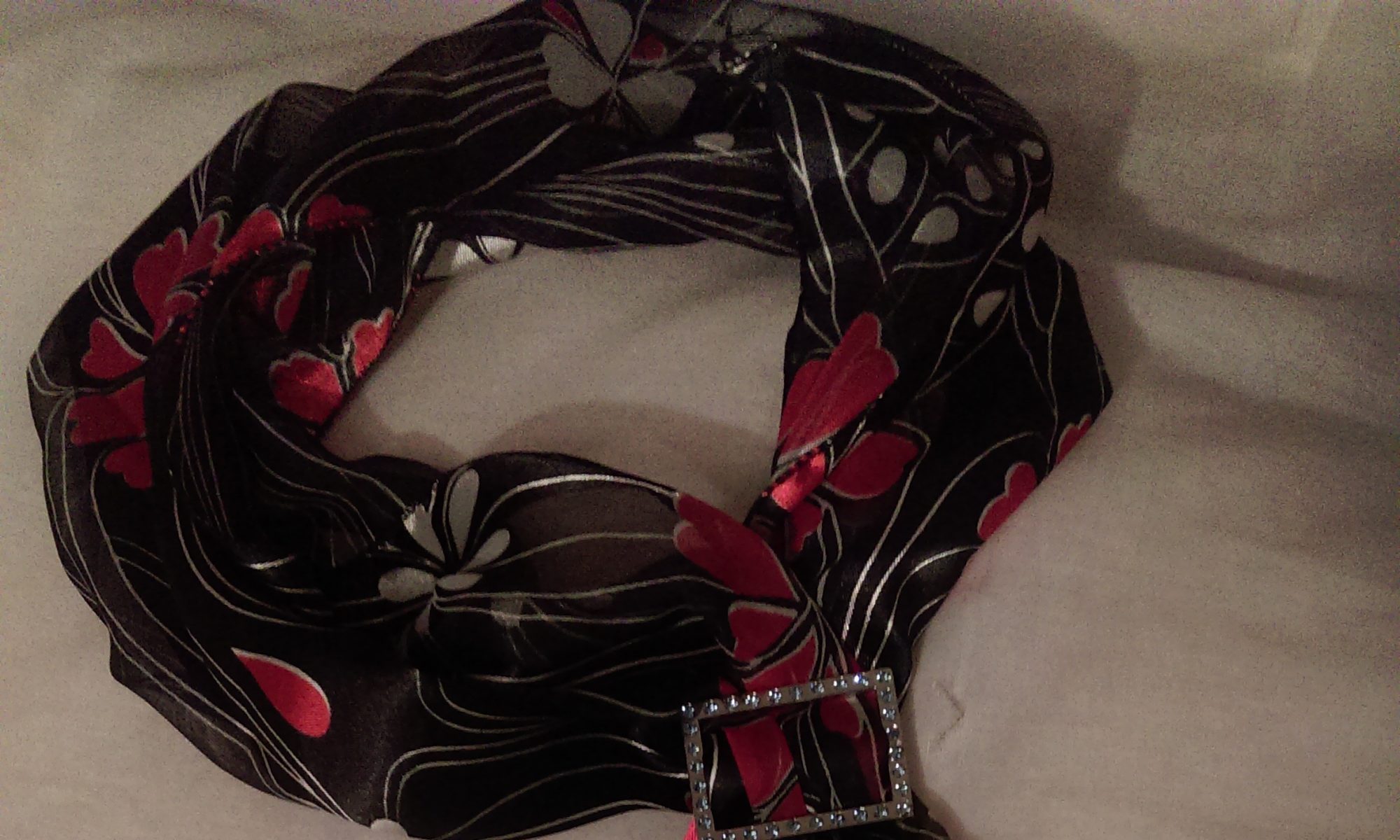
What is ux design?

What is ux design?

This is a question that our readers ask a lot.

Here is an article that answers the question as best we can if the term ux design is new or just generally confusing.

  1. Introduction
    • Definition of UX Design
    • Importance of UX Design in modern technology
  2. History of UX Design
    • Origin and evolution
    • Influential figures and milestones
  3. Core Principles of UX Design
    • Usability
    • Accessibility
    • Simplicity
    • Consistency
  4. Components of UX Design
    • User Research
    • Information Architecture
    • Interaction Design
    • Visual Design
    • Usability Testing
  5. Tools and Technologies
    • Software and platforms used by UX designers
    • Emerging technologies in UX
  6. UX Design Process
    • Stages of the UX Design Process
    • Methods and techniques used in each stage
  7. Challenges in UX Design
    • Common obstacles and how to overcome them
    • Balancing user needs with business goals
  8. Case Studies
    • Successful UX design examples
    • Lessons learned from failures
  9. Future of UX Design
    • Trends and predictions
    • AI and machine learning in UX
  10. Conclusion
    • Recap of the importance and impact of UX Design
    • Final thoughts

Article:

Introduction

when technology effects every aspect of our lives, User Experience (UX) has become important in the creation and success of products and services. UX Design focuses on improving the users satisfaction by improving the usability, accessibility, experienced in the usage between the user and the product. This article delves into the multifaceted world of UX Design, exploring its history, principles, processes, and future trends.

History of UX Design

The concept of UX Design is not new. Its roots can be traced back to the early 20th century when industrial designers like Henry Dreyfuss and Norman Bel Geddes began to emphasize the importance of user-centric design. However, the term “User Experience” was popularized in the 1990s by cognitive psychologist Don Norman.

Core Principles of UX Design

At its heart, UX Design is guided by several core principles:

  1. Usability: Ensuring that the product is as easy to use as possible.
  2. Accessibility: Making sure the product is accessible to all disabled users as well as everyone else.
  3. Simplicity: Striving for simplicity in design to avoid overwhelming users with unnecessary complexity.
  4. Consistent design: Ensure all design elements remain consistent for the end user.

Components of UX Design

UX Design is a complex subject that incorporates select areas , of design each playing a crucial role in creating a cohesive user experience. These components include:

  1. User Research: Understanding the users, their needs, behaviors, and pain points through methods like interviews, surveys, and user testing.
  2. Information gathering: Organizing and gathering information in a simple format.
  3. Interaction Design: Designing the elements of a product, such as buttons, columns, and pages, to ensure they are easy to understand.
  4. Visual Design: Improving the product, including layout, colors, and imagery, to create an aesthetically better experience.
  5. Usability Testing: Deciding on the product’s usability by observing actual users as they interact in live time with the actual product,gaining and documenting feedback, thus identifying areas for improvement.

Tools and Technologies

UX Designers rely on a many different tools to bring their designs to life. Popular tools include:

  1. Design Software: Tools like Sketch, Adobe XD, Figma, and InVision for creating wireframes, prototypes, and high-fidelity designs.
  2. User Testing Platforms: Services like UserTesting, Lookback, and UsabilityHub for conducting remote user testing.
  3. Analytics Tools: Tools like Google Analytics, Hotjar, and Crazy Egg for tracking user behavior and gathering insights.

Virtual Reality (VR), Augmented Reality (AR), and Artificial Intelligence (AI), are also shaping the future of UX Design, enabling more immersive and personalized experiences.

UX Design Process

The UX Design process is iterative and involves several stages:

  1. Research: Gathering information about users, competitors, and the market.
  2. Analysis: Analyzing the research data to identify key insights and user needs.
  3. Design: Creating wireframes, prototypes, and high-fidelity designs based on the insights.
  4. Testing: Real life  usability tests to gain feedback and point out areas for change.
  5. Working with others to change the design for the better.
  6. Evaluation: Continuously monitoring and evaluating the product’s performance to make necessary adjustments.

Each stage employs various methods and techniques, such as personas, user journeys, wireframing, prototyping, and A/B testing, to ensure a user-centered approach.

Challenges in UX Design

Despite its importance, UX Design comes with its own set of challenges:

  1. Balancing User Needs with Business Goals: Finding the right balance between creating a user-friendly product and achieving business objectives can be challenging.
  2. Keep Up to date  with Tech: The rapid pace of technological change requires UX Designers to stay on top of the latest tools and stratergies.
  3. Dealing with Constraints: Working within constraints, such as limited budgets, tight deadlines, and technical limitations, can be difficult.

To overcome these challenges, UX Designers need to be adaptable, proactive, and continuously seek feedback from users and stakeholders.

Case Studies

Examining successful and failed UX Design examples can provide valuable insights:

  1. Successful Example: Apple’s iPhone is often cited as a prime example of excellent UX Design. Its intuitive interface, seamless integration with other Apple products, and consistent design language have set a high standard in the industry.
  2. Failed Example: The Google Glass project failed to gain traction despite its innovative concept due to several UX issues, including privacy concerns, limited functionality, and a steep learning curve.

Analyzing these case studies helps highlight the importance of understanding user needs and testing designs thoroughly.

Future of UX Design

The future of UX Design is promising, with several exciting trends on the horizon:

  1. Artificial Intelligence and Machine Learning:
  2. These strategies allow more adaptive user experiences, predict user needs, and automate routine tasks.
  3. Voice User Interfaces (VUIs): There is an increase in smart speakers and voice assistants, designing for voice interactions is becoming increasingly important.
  4. Augmented and Virtual Reality: These two technologies allow new opportunities for interactive experiences.

As technology continues to improve, UX Designers need to be up-to-date and be able to innovate to meet changing needs.

Conclusion

So, UX Design is a fast-changing field that enables digital products and services to succeed. By focusing on usability, accessibility, simplicity, and consistency, UX Designers strive to create meaningful and enjoyable user experiences. As we look to the future, technologies will continue to change the future of UX Design, offering new challenges and opportunities for designers to explore. regardless of whether you’re an experienced designer or just starting in the design world, understanding the principles, processes, and potential of UX Design is required to produce products that genuinely resonate with users.

Giving back.

We are proud to support our community by donating a portion of our proceeds to two incredible organizations:

Thank you for helping us make a difference.

The power of colours you wear.

The Power of Color: How Colors Affect Your Mood and the Statements They Make
Introduction

  • There is importance in the colour you choose to wear. How specific colors can influence mood and convey messages to others.
    Section 1: Understanding Color Psychology
  • Definition of color psychology.
  • Explanation of how colors can influence emotions and perceptions.
  • Brief history and background of color psychology in different cultures and periods.
    Section 2: The Emotional Impact of Colors
  1. Red
  • Description: A powerful and bold color.
  • Emotional Impact: Can evoke feelings of passion, excitement, and urgency.
  • Statement to Others: Suggests confidence, energy, and sometimes aggression.
  1. Blue
  • Description: A calming and serene color.
  • Emotional Impact: Promotes feelings of tranquility, trust, and stability.
  • Statement to Others: Conveys professionalism, reliability, and calmness.
  1. Yellow
  • Description: A bright and cheerful color.
  • Emotional Impact: Encourages happiness, optimism, and warmth.
  • Statement to Others: Indicates friendliness, creativity, and enthusiasm.
  1. Green
  • Description: A natural and soothing color.
  • Emotional Impact: Associated with growth, harmony, and safety.
  • Statement to Others: Implies balance, health, and prosperity.
  1. Purple
  • Description: A luxurious and mysterious color.
  • Emotional Impact: Can inspire creativity, wisdom, and dignity.
  • Statement to Others: Suggests sophistication, spirituality, and ambition.
  1. Orange
  • Description: A vibrant and energetic color.
  • Emotional Impact: Invokes enthusiasm, excitement, and warmth.
  • Statement to Others: Conveys playfulness, creativity, and determination.
  1. Pink
  • Description: A soft and nurturing color.
  • Emotional Impact: Promotes feelings of love, compassion, and comfort.
  • Statement to Others: Indicates gentleness, femininity, and nurturing.
  1. Black
  • Description: A strong and authoritative color.
  • Emotional Impact: Can evoke power, elegance, and formality.
  • Statement to Others: Conveys sophistication, exclusivity, and sometimes intimidation.
  1. White
  • Description: A pure and clean color.
  • Emotional Impact: Associated with simplicity, cleanliness, and peace.
  • Statement to Others: Implies purity, minimalism, and neutrality.
  1. Gray
  • Description: A neutral and balanced color.
  • Emotional Impact: Can evoke feelings of calmness, neutrality, and sophistication.
  • Statement to Others: Suggests professionalism, formality, and timelessness.

Section 3: The Role of Colors in Different Contexts

  • Fashion
  • How different colors in clothing can affect mood and perception.
  • Examples of how to use color to make a statement with your wardrobe.
  • Interior Design
  • The impact of color choices in home and office environments.
  • Tips for using color to create desired moods in different spaces.
  • Marketing and Branding
  • How businesses use color to influence consumer behavior.
  • Case studies of successful color usage in branding and advertising.

Section 4: Cultural Variations in Color Perception

  • Explanation of how different cultures perceive and react to colors.
  • Examples of cultural differences in color symbolism.
  • Tips for considering cultural context when choosing colors.

Section 5: Practical Tips for Using Color to Influence Mood and Make Statements

  • How to choose colors that align with your desired mood and message.
  • Practical applications in everyday life: from personal style to professional settings

The Power of Color: How Colors Affect Your Mood and the Statements They Make

Introduction.

From the vibrant hues of a sunset to the calming shades of a serene ocean, color is an integral part of our daily lives. It has the power to evoke emotions, influence decisions, and convey messages without uttering a single word. This phenomenon, known as color psychology, is not only a fascinating subject but also a practical tool used in various fields such as marketing, fashion, interior design, and personal branding.
The purpose of this blog is to delve into the world of color psychology, exploring how specific colors can influence our mood and the statements they make to others. By learning the emotional impact of colors, you can make more informed choices in your personal and professional life, enhancing your ability to communicate and connect with others.

Section 1: Understanding Color Psychology

Psychology is the study of how colors affect people’s behavior and emotions. It is a field that combines elements of psychology, art, and design to understand the powerful effects that colors can have on our mental and emotional states. While the impact of color can be different for different people and influenced by personal experiences and cultural backgrounds, certain trends and patterns have been observed across different demographics.

Historically, color has held significant meaning in various cultures and periods. For example, in ancient Egypt, colors were used in rituals and had symbolic meanings. Similarly, in medieval Europe, color was an important aspect of heraldry and conveyed information about lineage and status. Today, the principles of color psychology are applied in numerous industries to create desired reactions and perceptions.


Section 2: The Emotional Impact of Colors
Red

  • Description: A powerful and bold color, red is often associated with strong emotions.
  • Emotional Impact: Red can evoke feelings of passion, excitement, and urgency. It can increase heart rate and create a sense of alertness.
  • Statement to Others: Wearing or using red can suggest confidence, energy, and assertiveness. It can also indicate aggression or a desire to stand out.
    Blue
  • Description: A calming and serene color, blue is often linked to the sky and the sea.
  • Emotional Impact: Blue promotes feelings of tranquility, trust, and stability. It helps reduce stress and creates a feeling of calmnesss.
  • Statement to Others: Blue conveys professionalism, reliability, and calmness. It’s often used in corporate settings to establish trust and dependability.

Yellow

  • Description: A bright and cheerful color, yellow is reminiscent of sunlight and warmth.
  • Emotional Impact: Yellow encourages happiness, optimism, and energy. This colour greatly stimulates you mentally, while evoking feelings of pure joy.
  • Statement to Others: Yellow indicates friendliness, creativity, and enthusiasm. It can make you appear more approachable and lively.

Green

  • Description: A natural and soothing color, green is associated with nature and tranquility.
  • Emotional Impact: Green is linked to growth, harmony, and safety. It can create a sense of balance and rejuvenation.
  • Statement to Others: Green implies balance, health, and prosperity. It’s often used to convey eco-friendliness and sustainability.

Purple

  • Description: A luxurious and mysterious color, purple has historical ties to royalty and spirituality.
  • Emotional Impact: Purple can inspire creativity, wisdom, and dignity. It often evokes feelings of mystery and introspection.
  • Statement to Others: Purple suggests sophistication, spirituality, and ambition. It can make you appear more imaginative and noble.
    Orange
  • Description: A vibrant and energetic color, orange mixes the warmth of red and the cheerfulness of yellow.
  • Emotional Impact: Orange invokes enthusiasm, excitement, and warmth. It can stimulate appetite and social interaction.
  • Statement to Others: Orange conveys playfulness, creativity, and determination. It’s a color that stands out and draws attention.
    Pink
  • Description: A soft and nurturing color, pink is often associated with love and tenderness.
  • Emotional Impact: Pink promotes feelings of love, compassion, and comfort. It can have a calming effect and reduce aggression.
  • Statement to Others: Pink indicates gentleness, femininity, and nurturing. It can make you appear more caring and approachable.
    Black
  • Description: A strong and authoritative color, black is often associated with elegance and formality.
  • Emotional Impact: Black can evoke power, elegance, and seriousness. It can also create a sense of mystery and sophistication.
  • Statement to Others: Black conveys sophistication, exclusivity, and sometimes intimidation. It’s often used to make a bold and strong statement.
    White
  • Description: A pure and clean color, white is often linked to simplicity and peace.
  • Emotional Impact: White is associated with simplicity, cleanliness, and peace. It can create a sense of openness and clarity.
  • Statement to Others: White implies purity, minimalism, and neutrality. It can make you appear more organized and clean.
    Gray
  • Description: A neutral and balanced color, gray is often seen as conservative and sophisticated.
  • Emotional Impact: Gray can evoke feelings of calmness, neutrality, and sophistication. It often creates a sense of balance and stability.
  • Statement to Others: Gray suggests professionalism, formality, and timelessness. It’s often used to convey maturity and reliability.
    Section 3: The Role of Colors in Different Contexts.

  • Fashion
    Color plays a big role in fashion, influencing how we feel and how others perceive us. The colors we wear can reflect our mood, and the mood of others.
  • Red in Fashion: Wearing red can make a powerful statement, suggesting confidence and boldness. It’s perfect for occasions where you want to stand out or make an impression.
  • Blue in Fashion: Blue is a safe choice for professional settings, as it conveys reliability and calmness. It’s often used in corporate attire and uniforms.
  • Yellow in Fashion: Yellow can brighten up your wardrobe and mood, making you appear more cheerful and approachable. It’s great for casual and creative settings.
  • Green in Fashion: Green clothing can give off a balanced and refreshing vibe, perfect for eco-friendly events or casual outings.
  • Purple in Fashion: Purple can add a touch of luxury and creativity to your outfit, making it suitable for artistic and formal occasions.
  • Orange in Fashion: Orange can be a fun and energetic addition to your wardrobe, ideal for social events and parties.
  • Pink in Fashion: Pink can make you appear more nurturing and gentle, suitable for casual and romantic settings.
  • Black in Fashion: Black is a timeless choice that exudes elegance and authority, perfect for formal events and professional settings.
  • White in Fashion: White can create a clean and crisp look, ideal for summer outfits and minimalist styles.
  • Gray in Fashion: Gray can add a touch of sophistication and neutrality to your outfit, suitable for both professional and casual settings.
    Interior Design
    Color choices in interior design can impact on your mood.
  • Red in Interiors: Red can add energy and warmth to a room, making it useful for living rooms.
  • Blue in Interiors: Blue can creates a serene environment, perfect for upstairs rooms.
  • Yellow in Interiors: Yellow can brighten up a space and evoke feelings of happiness, making it suitable for kitchens and playrooms.
  • Green in Interiors: Green can add a touch of nature and tranquility, ideal for home offices and living rooms.
  • Purple in Interiors: Purple can create a luxurious and creative atmosphere, perfect for bedrooms and artistic spaces.
  • Orange in Interiors: Orange can add vibrancy and warmth to a room, suitable for social spaces and workout areas.
  • Pink in Interiors: Pink can create a nurturing and comforting environment, ideal for bedrooms and nurseries.
  • Black in Interiors: Black can add sophistication and elegance, perfect for modern and minimalist designs.
  • White in Interiors: White can create a clean and open space, suitable for any room in the house.
  • Gray in Interiors: Gray can add a touch of neutrality and balance, ideal for living rooms and offices.
    Marketing and Branding
    Businesses often use color to influence consumer behavior and convey their brand message. Here are some examples of how different colors are used in marketing and branding.
  • Red in Marketing: Red can create a sense of urgency and excitement, making it ideal for clearance sales and promotions.
  • Blue in Marketing: Blue can establish professionalism, often used by financial salesmen, it is the advised colour to wear in job interviews, as it evokes trust in the wearer.
  • Yellow in Marketing: Yellow can grab attention and evoke feelings of happiness, suitable for children’s products and food brands.
  • Green in Marketing: Green can convey eco-friendliness and health, often used by organic and sustainable brands.
  • Purple in Marketing: Purple can suggest luxury and creativity, suitable for high-end products and artistic brands.
  • Orange in Marketing: Orange can evoke enthusiasm and energy, often used by sports brands and fast food chains.
  • Pink in Marketing: Pink can appeal to a younger and more feminine audience, suitable for beauty and fashion brands.
  • Black in Marketing: Black can create a sense of exclusivity and sophistication, ideal for luxury brands and formal products.
  • White in Marketing: White can convey simplicity and purity, often used by tech companies and minimalist brands.
  • Gray in Marketing: Gray can suggest professionalism and neutrality, suitable for corporate branding and tech products.
    Section 4: Cultural Variations in Colour meaning.
    The perception of color can vary in meaning in different cultures, making it important to consider cultural context when choosing colors.
  • Red in Different Cultures: In China, red is a symbol of good luck and prosperity, often used in celebrations. In Western cultures, red can signify love and passion.
  • Blue in Different Cultures: In many cultures, blue is associated with trust and stability. In Hinduism, blue is linked to the divine and the infinite.
  • Yellow in Different Cultures: In Japan, yellow represents courage and nobility. In Western cultures, it is often associated with happiness and cheerfulness.
  • Green in Different Cultures: In Islamic cultures, green is a sacred color symbolizing paradise. In Western cultures, it is linked to nature and health.
  • Purple in Different Cultures: In many cultures, purple is associated with royalty and spirituality. In Thailand, widows mourn in this colour.
  • Orange in Different Cultures: In Hinduism, orange is a sacred color representing fire and purity. In Western cultures, it is associated with autumn and warmth.
  • Pink in Different Cultures: In Japan, pink is linked to cherry blossoms and represents spring. In Western cultures, it is often associated with femininity and romance

The use of mood boards in design.

Types of Mood Boards

The boards are available in either physical or digital, each come with its own pros and cons.

  • Physical Mood Boards: These involve tangible materials such as magazine cutouts, fabric swatches, and printed images, assembled on a board or canvas. Physical mood boards offer a hands-on, tactile experience and are particularly useful for interior design and fashion projects.
  • Digital Mood Boards: Created using software like Adobe Photoshop, Illustrator, or online tools like Pinterest and Canva, digital mood boards offer greater flexibility and ease of sharing. They are ideal for web design, graphic design, and other digital-focused projects.

The Role of Mood Boards in Design

Visual Communication

One of the primary functions of a mood board is to communicate visual ideas effectively. Design is an inherently visual discipline, and mood boards provide a means to convey abstract concepts in a tangible form. This visual communication is crucial for aligning the vision of the designer with that of the client or stakeholders.

  • Client Communication: Mood boards serve as a bridge between the designer’s creative vision and the client’s expectations. By presenting a curated selection of visual elements, designers can ensure that they are on the same page with their clients from the outset.
  • Team Collaboration: In collaborative projects, mood boards help maintain consistency and coherence. They provide a visual reference that all team members can refer to, ensuring that everyone is working towards the same aesthetic goals.

Inspiration and Ideation

Mood boards are not only a communication tool but also a source of inspiration. The process of creating a mood board involves extensive research and exploration, which can spark new ideas and directions for a project.

  • Creative Exploration: As designers gather and arrange elements for their mood board, they often discover unexpected connections and insights. This creative exploration can lead to innovative design solutions and a deeper understanding of the project’s potential.
  • Concept Development: Mood boards help in refining and developing design concepts. By visually experimenting with different elements, designers can test and iterate on their ideas before choosing the design.

Project Direction and Focus

Mood boards provide a clear sense of direction and focus for a design project. They act as a roadmap that guides the designer through the various stages of the design process.

  • Setting the Tone: The visual elements on a mood board collectively set the tone and mood of the project. Whether it’s a serene and minimalist design or a bold and vibrant one, the mood board establishes the overall atmosphere that the design should evoke.
  • Consistency and Coherence: Throughout the design process, the mood board serves as a reference point, ensuring that all design decisions align with the initial idea.

Practical Applications of Mood Boards

Interior Design

In interior design, mood boards are an essential tool for conceptualizing and planning spaces. They help designers visualize how different elements will come together to create a harmonious environment.

  • Material Selection: Mood boards allow designers to experiment with different materials, such as fabrics, wallpapers, and finishes. By arranging these samples together, designers can see how they interact and complement each other.
  • Color Schemes: Making the right color scheme is vital in interior design. Mood boards enable designers to test various color combinations and assess their impact on the overall aesthetic.

Fashion Design

Fashion designers use mood boards to explore themes, trends, and styles for their collections. They provide a visual narrative that guides the design of garments and accessories.

  • Trend Research: Mood boards help fashion designers stay updated with the latest trends and inspirations. By compiling images and materials that reflect current fashion movements, designers can ensure their collections are relevant and appealing.
  • Theme Development: For each collection, fashion designers often work with a specific theme or concept. Mood boards help in defining and elaborating on these themes, ensuring that all pieces in the collection are cohesive and aligned with the overall vision.

Graphic and Web Design

In graphic and web design, mood boards present digital products easily.

  • Brand Identity: Mood boards help designers create a strong visual identity for brands. By experimenting with different logos, fonts, and color schemes, designers can develop a brand look that resonates with the target audience.
  • User Interface (UI) Design: For web and app design, mood boards aid in defining the look and feel of the user interface. They help designers visualize the layout, typography, and visual styles will improve the users journey.

Advertising and Marketing

In advertising and marketing, mood boards are used to conceptualize campaigns and visual strategies. They help in crafting compelling visual stories that resonate with the target audience.

  • Campaign Planning: Mood boards assist in planning advertising campaigns by visualizing the key messages, imagery, and style. This ensures that all elements of the campaign are aligned and effectively communicate the desired message.
  • Content Creation: For content creators and marketers, mood boards provide inspiration for creating engaging visuals. They help in brainstorming ideas for social media posts, videos, and other marketing materials.

The Process of Creating a Mood Board

Step 1: Define the Objective

The first step in creating a mood board is to clearly define the objective of the project. This involves understanding the client’s needs, target audience, and the desired outcome. A well-defined objective provides a clear direction for the mood board and ensures that it effectively serves its purpose.

Step 2: Gather Inspiration

Once the objective is defined, the next step is to gather inspiration. This involves collecting a wide range of visual materials that align with the project’s goals. Sources of inspiration can include:

  • Online Resources: Websites like Pinterest, Behance, and design blogs offer a wealth of visual inspiration. Designers can create digital collections or save images that resonate with their vision.
  • Magazines and Books: Print publications provide high-quality imagery and inspiration for mood boards.
  • Real-world Observations: Sometimes, the best inspiration comes from the real world. Observing nature, architecture, and everyday objects can spark unique ideas and perspectives.

Step 3: Curate and Organize

With a collection of inspirational materials, the next step is to curate and organize them into a cohesive mood board. This involves selecting the most relevant and impactful elements and arranging them in a way that tells a visual story.

  • Theme and Style: Identify common themes and styles in the collected materials and group them accordingly. This helps in creating a focused and coherent mood board.
  • Layout and Composition: Arrange the selected elements on the mood board in a visually appealing manner. Consider the balance, hierarchy, and flow of the composition to ensure that it effectively communicates the desired mood.

Step 4: Refine and Finalize

The final step is to refine the mood board and make any necessary adjustments. This involves reviewing the composition, ensuring that all elements align with the project’s objective, and making any final tweaks.

  • Feedback and Iteration: Share the mood board with clients or team members for feedback. Incorporate any suggestions and make necessary revisions to ensure that the mood board accurately reflects the desired vision.
  • Final Presentation: Once refined, present the mood board to the client or team. Use it as a reference throughout the design process to maintain consistency and alignment with the initial vision.

Benefits of Using Mood Boards

Enhanced Communication

Mood boards significantly enhance communication between designers, clients, and stakeholders. They provide a way to explain ideas, making it easier to convey concepts and align expectations.

Improved Creativity and Innovation

The process of creating mood boards fosters creativity and innovation. By exploring and experimenting with different visual elements, designers can discover new ideas and push the boundaries of their creativity.

Efficient Decision-Making

Mood boards facilitate efficient decision-making by providing a clear visual reference. They help in quickly assessing the suitability of different design elements and making informed decisions.

Consistency and Coherence

Mood boards ensure consistency and coherence throughout the design process. They serve as a visual guideline that keeps the project aligned with the initial vision, resulting in a polished and cohesive final product.

Client Satisfaction

By effectively communicating the design vision and ensuring alignment with the client’s expectations, mood boards contribute to higher client satisfaction. They help in avoiding misunderstandings and ensuring that the design is liked by clients.

Conclusion

Boards are needed.They offer lots of benefits that enhance the design process. They facilitate effective communication, inspire creativity, provide direction, and ensure consistency.

Hide your burdens under your Turbans